Games of the XXXIV Olympiad
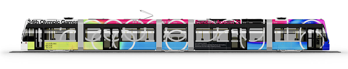
In celebration of the Games of the Thirty-Fourth Olympiad coming to the city of Los Angeles, I created a compelling visual identity which recalled the legendary designs of Mexico City 68 and Munich 72, while maintaining a future-facing vibe the remained true to the vibrancy of the Southern California community. The identity had to be designed at two scales—the first for the broader global audience who experience the games through the television, the second for locals, visitors, and athletes who will be in the city during the competition. Both strove to achieve financial viability through the use of existing infrastructure and lightweight components, echoing the success of the Summer Olympic Games held here in 1984. The end result was an eclectic yet coherent visual strategy that could be recognized from 10,000 feet all the way down to the street.
Olympic Logo
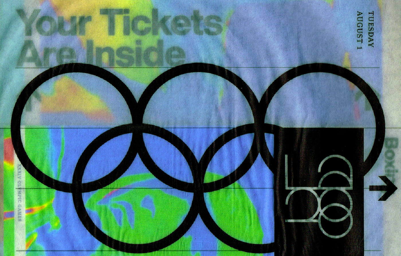
Having established a design ethos which seeks increased efficiency through the use of existing parts, I began by reconstructing the historic Olympic logo to achieve greater mathematical harmony and structural integrity. The result is the same recognizable rings, but now they are interlocked shoulder-to-shoulder, achieving greater strength through unity. This geometric arrangement would serve as the grid for following marks, letter forms, and layouts.

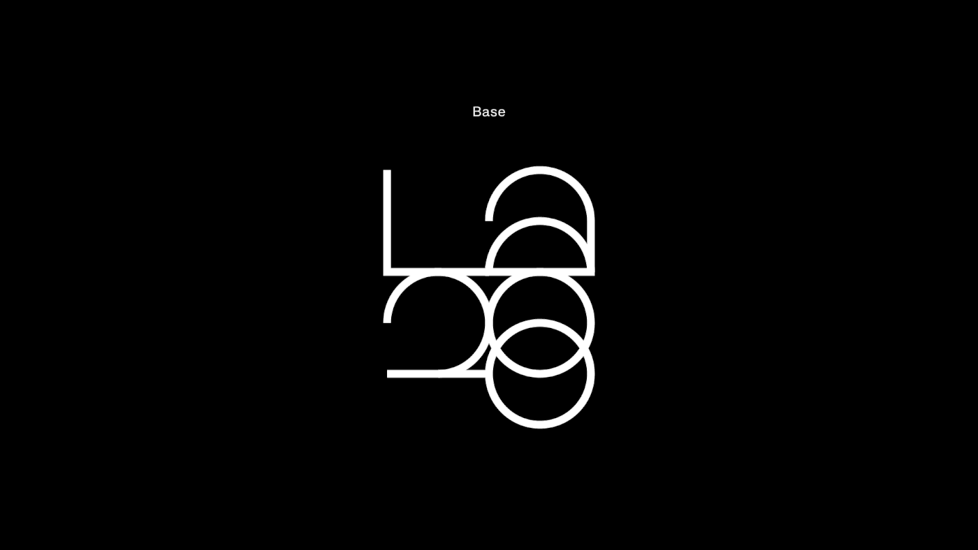
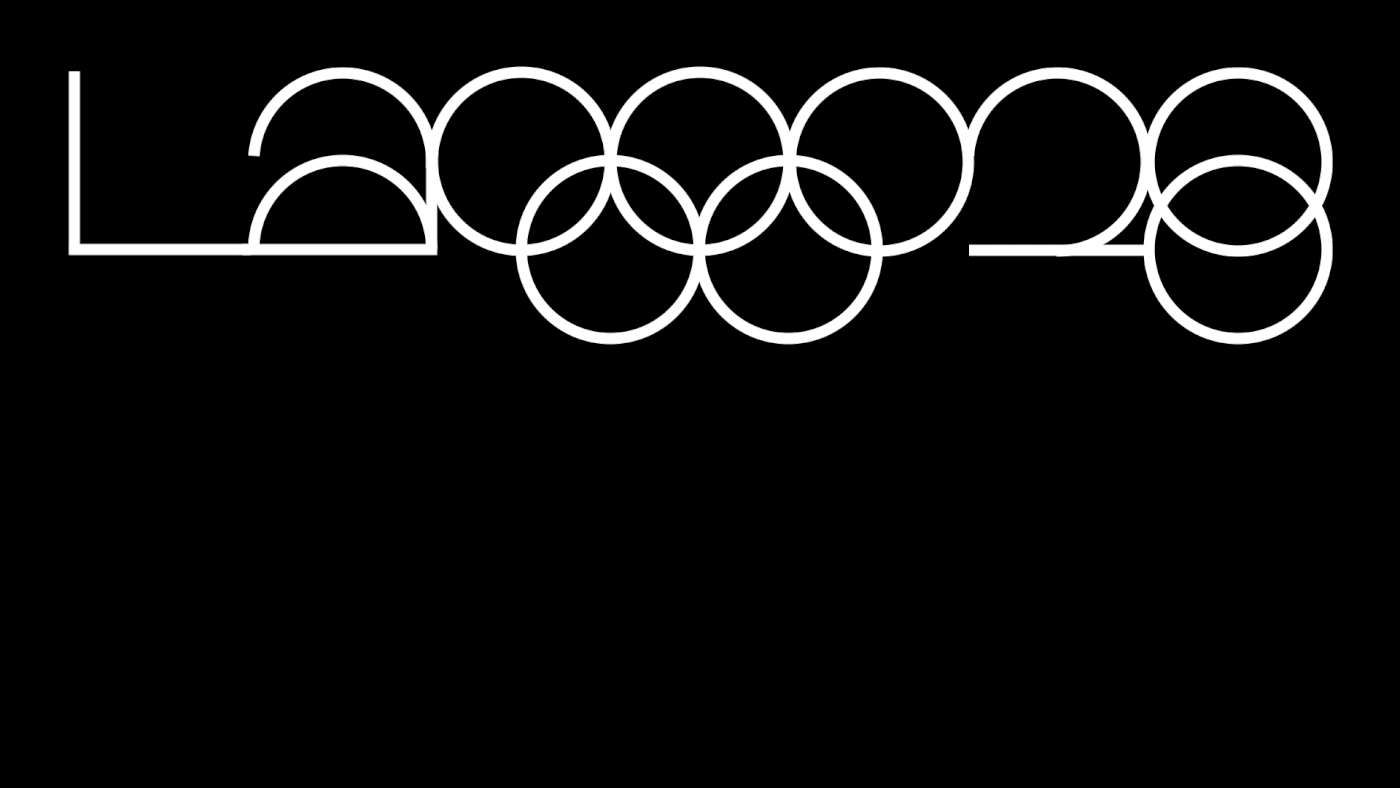
LA28 Logo
Working from the redesigned Olympic rings as a guide. I created a modular, geometric word mark for the games’ shorthand, LA28. This mark was designed to live in unison with the new Olympic rings, but it can function equally well on its own. The mark can be deployed in either a stacked or horizontal layout.
Display Typeface
Finally, I built out an entire alphabet based on the letterforms from the logo above. This highly abstract interpretation would be used as a display face for the event. Together, the font, the logo mark, and the Olympic rings would be used to generate the grid for each unique typographic canvas.

Poster
The core of the identity is a series of sixteen double-sided posters, each with a different day of the Olympic’s full- and gold-medal schedule. The underlining grid of the layouts were derived from the repeating geometric forms in the two new marks.


Interaction
Additionally, the poster series can be used as a canvas for an interactive schedule. As a user walks past the posters, a motion sensor detects their position and triggers a video which cycles through the days gold medal schedule. If the user would like to know more, they can approach the poster and read the finer print detail. This experience would be deployed at high pedestrian traffic areas around the Southern California region.
Schedule Booklet + Ticket Holster
Finally, the posters are folded down into a four-page schedule booklet. This is wrapped in a slip cover that houses event tickets. Each attendee would receive this when they purchase their tickets.


Tickets


Website
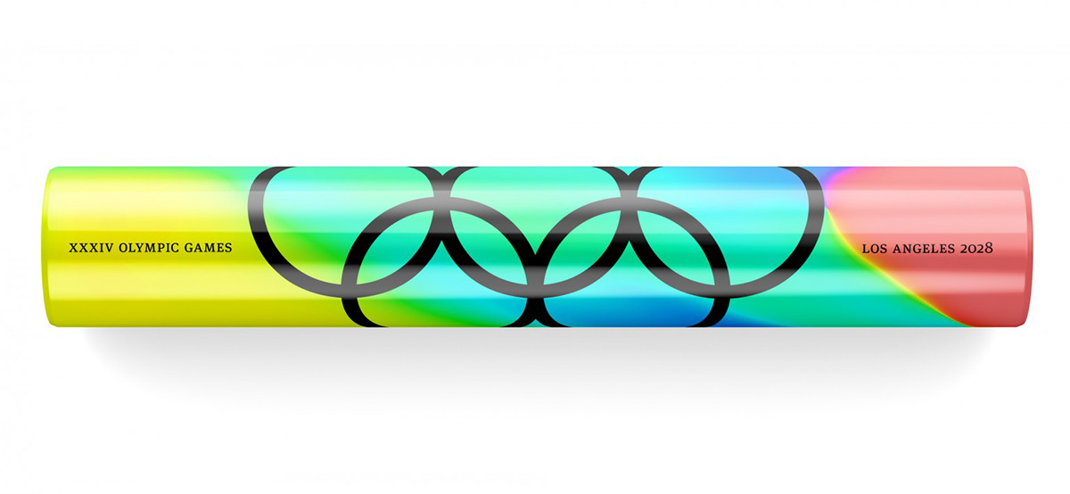
Balls + Batons


Wraps